Mapping the Money: How to Identify Genuine Sector Rotation Before It Registers on a Chart
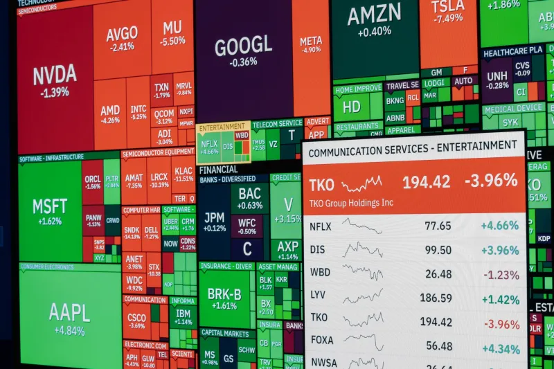
Sector rotation is one of the most consistently profitable phenomena in equity markets — and one of the most consistently mistimed by retail participants. By the time a rotation appears on a traditional price chart, the bulk of the institutional move has already occurred. The traders entering on visible momentum are frequently buying from those who positioned weeks earlier.
The question is not whether rotation is happening. In a functioning equity market, capital is always moving between sectors in response to changes in the macroeconomic cycle, interest rate expectations, and relative earnings momentum. The question is how to detect that movement before it becomes a headline.
Why Charts Alone Are Insufficient
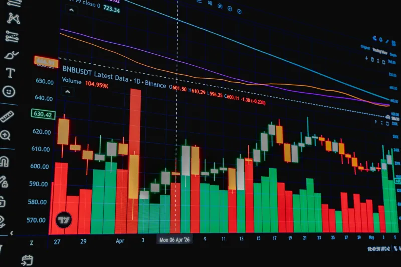
Price charts reflect what has already happened. They are the output of a market process, not its input. By the time a sector ETF breaks to a multi-month high with expanding volume — the classic technical signal — institutional accumulation has typically been underway for weeks.
This lag exists because large funds cannot build positions quickly without moving prices. They accumulate gradually, often using periods of low volatility or market-wide weakness to establish exposure. The price effect of their activity is initially invisible within the noise of normal market fluctuation. Only when their buying reaches sufficient scale does the price chart begin to reflect the underlying demand.
Detecting rotation early requires moving upstream — to the data that precedes price movement rather than reflects it.
Correlation Decay as a Leading Signal
The most reliable early indicator of genuine sector rotation is a breakdown in the correlation between two historically linked sectors. Under normal market conditions, cyclical sectors such as industrials and materials tend to move in tandem, as do defensive sectors such as utilities and consumer staples. When those correlations begin to decay — when sectors that typically move together start diverging in direction or magnitude — it indicates that capital flows are differentiating between them.
To measure this in practice, calculate a rolling 10-day correlation between the daily returns of two related sector ETFs. Under stable conditions, this figure will hover in a consistent range. When it begins declining meaningfully — particularly if it crosses below its 30-day average — that divergence is worth investigating further.
Correlation decay alone does not confirm rotation. It signals that something is changing in how institutional capital is being allocated between those sectors. The next step is determining which sector is the beneficiary.
Volume Migration as Directional Confirmation
Relative volume provides the directional component that correlation decay cannot. When capital rotates out of one sector and into another, the receiving sector typically begins experiencing volume expansion before its price chart shows a clear breakout. This volume migration reflects institutions actively building positions — demand that has not yet fully translated into price.
The metric to monitor is relative volume: current session volume as a multiple of the 20-day average for each sector ETF. A sector running at 1.5 to 2.0 times its average volume on up days, while a historically correlated sector shows declining volume on flat or down days, is a meaningful divergence pattern.
This is not a one-day observation. Authentic rotation typically manifests as a multi-session pattern of volume migration — three to five trading days in which the receiving sector consistently shows above-average volume while the departing sector shows the opposite. A single anomalous day can reflect program rebalancing or index reconstitution. A sustained pattern reflects genuine reallocation.
Futures Curve Positioning as Macro Confirmation
Equity sector rotation does not occur in a vacuum. It is almost always driven by a shift in the macroeconomic narrative — expectations about growth, inflation, interest rates, or corporate earnings. Futures markets, which reflect forward-looking institutional views, often price these narrative shifts before equity sector flows become visible.
For traders monitoring potential rotation into rate-sensitive sectors such as financials or real estate, tracking the shape of the Treasury futures curve provides essential context. A curve that is steepening — with longer-dated yields rising faster than shorter-dated yields — is a macro backdrop that has historically supported financials and pressured utilities. If correlation decay and volume migration in those sectors coincide with a steepening curve, the three signals together constitute a much stronger case for rotation than any single indicator alone.
Similarly, commodity futures positioning can confirm or challenge apparent rotation into materials and energy. Rising open interest in crude oil or copper futures, combined with equity-side signals in those sectors, provides cross-market validation that the rotation reflects a genuine macro shift rather than short-term noise.
A Step-by-Step Playbook
The following sequence integrates these signals into an actionable process:
Step 1: Screen for correlation decay. Run rolling 10-day correlations across all major sector ETF pairs daily. Flag any pair where the correlation has declined by more than 0.20 over the past five sessions.
Step 2: Identify volume migration direction. For each flagged pair, compare relative volume trends over the past five sessions. Determine which sector is showing expanding volume on positive days and which is showing declining volume.
Step 3: Cross-reference macro futures. Check whether the relevant macro futures markets — Treasuries, commodities, or currency pairs depending on the sectors involved — are confirming the direction suggested by equity-side signals.
Step 4: Assess entry timing. The optimal entry point is typically when all three signals are aligned but before the price chart has produced a visible breakout. This usually corresponds to the third or fourth day of sustained volume migration.
Step 5: Define the invalidation level. Every rotation trade needs a clear exit trigger if the thesis fails. Correlation re-convergence, volume reversal in the receiving sector, or a contradictory move in the confirming futures market all constitute invalidation signals.
Distinguishing Rotation from Noise
Not every correlation decay or volume spike represents a genuine rotation. Market-wide volatility events — a Federal Reserve announcement, a geopolitical shock, a major index reconstitution — can temporarily distort sector correlations and volumes without triggering any lasting reallocation.
The distinction lies in persistence and breadth. A genuine rotation develops over multiple sessions and tends to appear across several related sectors simultaneously. A noise event typically produces a one or two-day distortion that reverts as markets stabilize. Waiting for the multi-session confirmation pattern before committing capital is the discipline that separates a systematic rotation framework from reactive trading.